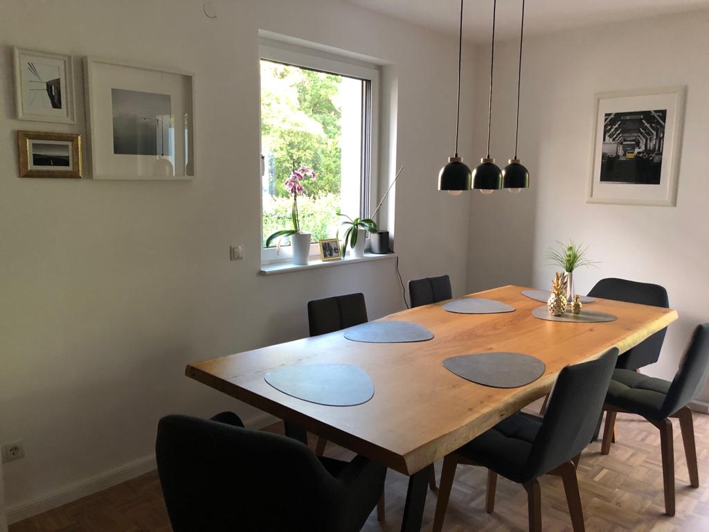
For our European interior design dining room and kitchen decor, we’re staying true to our basic Scandinavian style with an industrial twist in our new house, though there are some adjustments that the move and slightly different room layout will bring.
Dining room – basic considerations for our interior design
Perspectively, we would like to replace the dining room seating, there we would like to have cantilever chairs for durability reasons – or a design classic (I’m not saying Wishbone Chair now – but yes). But since that’s not an urgent investment at the moment, we just need an idea for the right style to go with it.
A rug under the dining table should ideally be washable, as the kids like to drop things. The table stays – we will replace the chairs eventually.

Kitchen – basic considerations for our interior design
In addition to the dining room, the layout of the kitchen and kitchen planning in general has already occupied us during the floor planning phase. The eye-catcher in the kitchen is the open ceiling above the kitchen island. There is a skylight there, so we have plenty of natural light from above in the kitchen as well. The opening is to the second floor hallway, and the balustrade repeats the elements of the staircase: the handrail is made of beech wood painted in a dusty gray (RAL 7037) with round black metal rods, as well as the open wooden staircase.
The kitchen counter will finish with the ceiling above. For this purpose, we adjusted the floor plan upstairs, so as not to look at kitchen cabinets from above and form a “dust shelf”.
The kitchen surface is black matte, the countertop has a height of 95 cm (about 37.4 in), which is ergonomic for us. Glass wall cabinets above the sink have interior lighting. At the kitchen island there is no high counter, because directly adjacent will be our 2.5 m (ca. 98.43 in) dining table.
More on interior design
-
Interior Design in Viebrock House Edition 600
Our selection of interior design elements – final status after sampling You may see pictures of the new construction on this blog in a few months and wonder what choices we made for the interior in our Viebrock house. Well, without further ado, here are the main elements of the interior in the Viebrock house…
-
Living room furnishings in Scandi Industrial style
General considerations The living area should separate a bit from the dining and cooking area. Hurdles are the orientation of the sofa with open end on the left (in the front view) and the French doors in the living room that go out to the terrace. The main access to the terrace should be through…
-
House hallway furnishings without chaos, but suitable for children
General considerations The hallway should welcome us with family pictures, but not reveal a chaos of jackets and shoes. Besides the pictures, at least one mirror on the wall would be beneficial to make sure the hairstyle is right before leaving the house ;). Jackets and shoes for the kids should be easily accessible to…
-
Costs and incidental expenses when building a house – what is involved?
During many consultations with various house builders, we got the impression that the ancillary costs at Viebrock are the most realistic (and therefore the most expensive). In our comparison of home building costs and utilities, we had Massa Haus, Weber Haus, Kage Bau and Viebrock. Here is an excerpt from our list of the incidental…
-
Timeless children’s room furnishings are easy to maintain
General considerations for two little kids Rooms should have plenty of storage space to stow toys in boxes or baskets. The baskets should be decorative and are welcome to stand on open shelves. Hiding everything then would somehow not be nursery-like and too “clean” for me personally. The closets should integrate well into the room,…
-
Style in the children’s room: Scandinavian minimalist design
…and why the “high-gloss nursery” remains a myth An episode on the subject of style in the nursery has remained in my memory during the purchase of my wedding dress – I was already clearly pregnant. The saleswoman told me about her son and her view of style. The eight-year-old was not allowed to have…
Leave a Reply